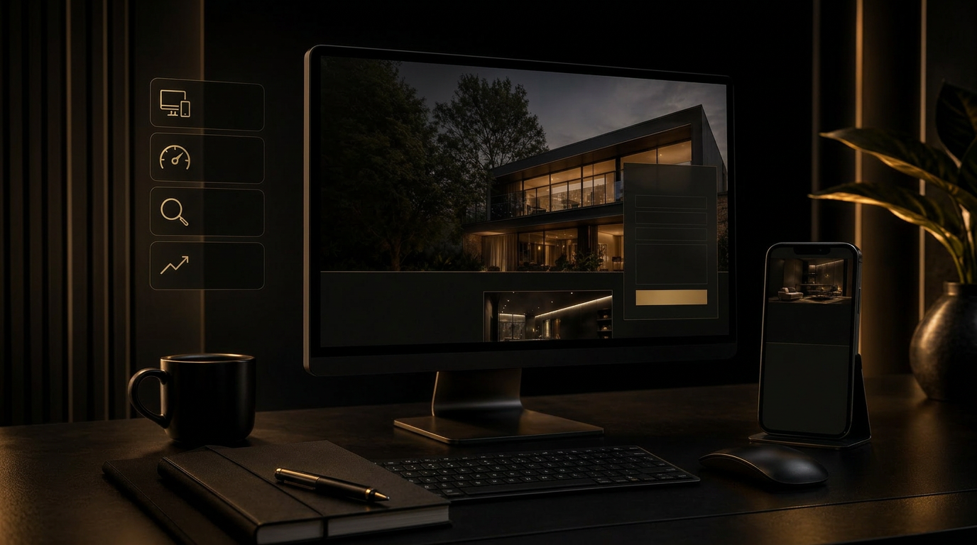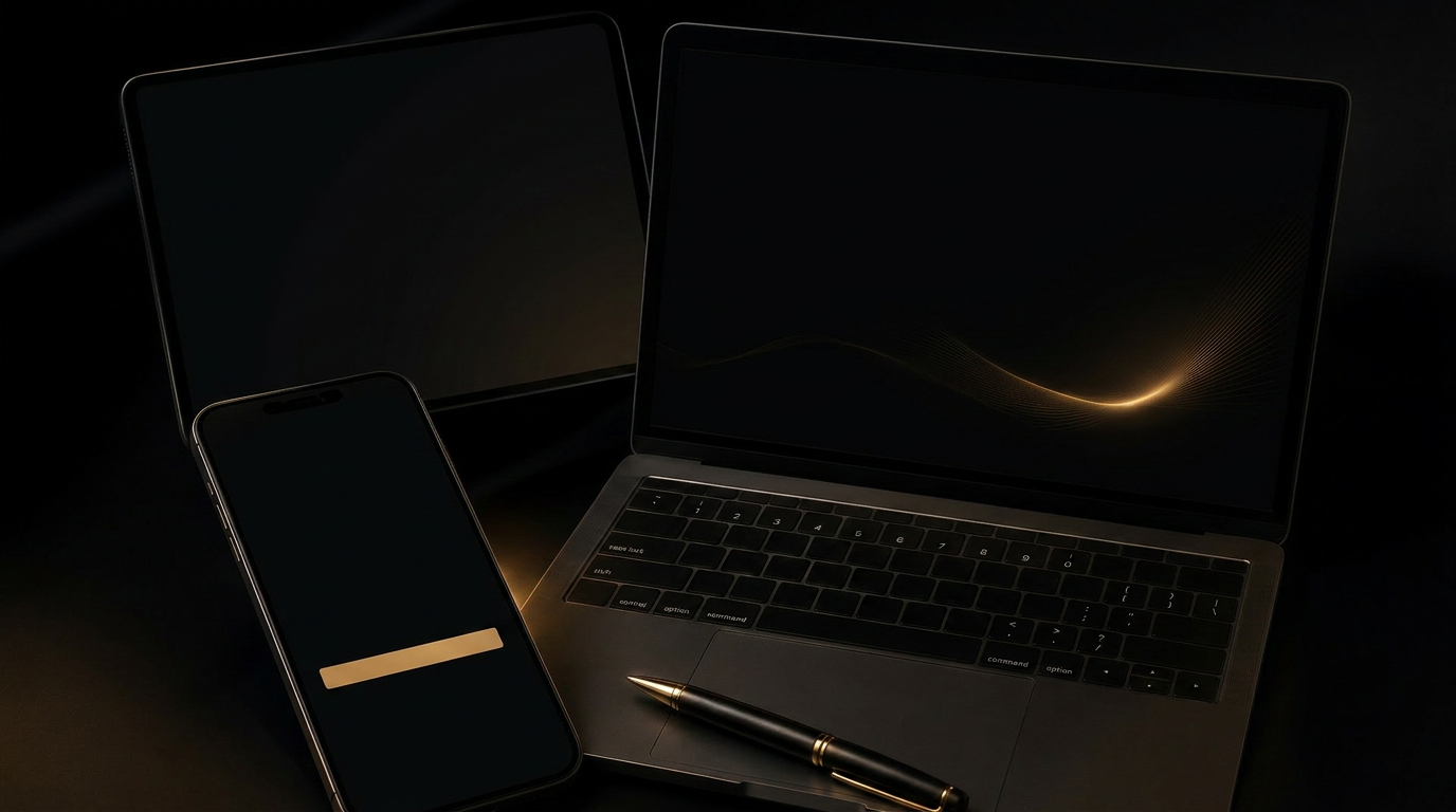
‘Premium’ is one of the most overused words in modern web design. Most sites that claim it have simply switched to a darker background and a serif headline. Real premium feel is not a style — it is a set of decisions the visitor cannot quite name.
The components of premium
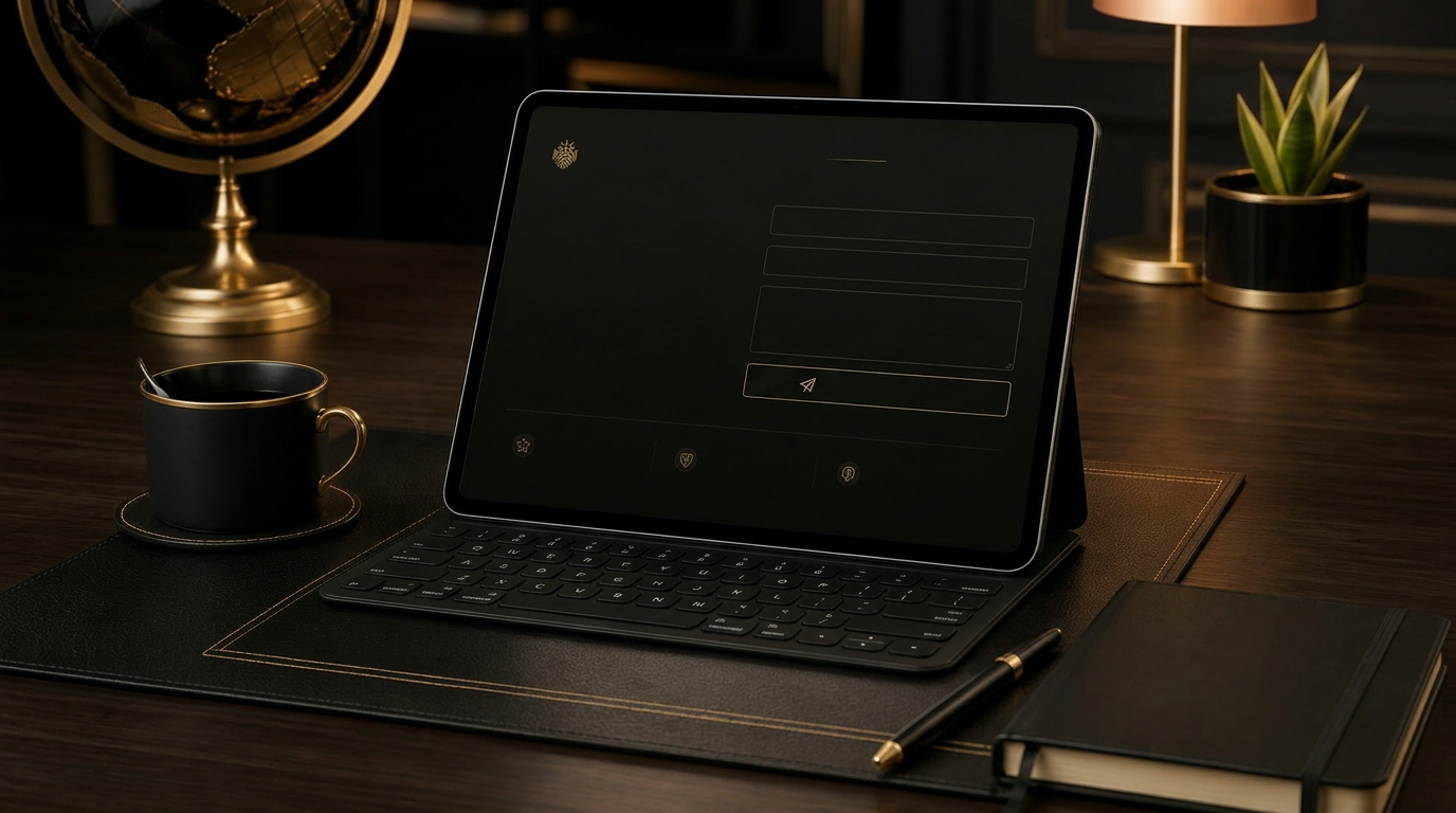
- Generous, intentional white space — not laziness, but restraint.
- A typographic hierarchy you could read from across the room.
- Imagery that looks commissioned, not selected from a stock library.
- Motion that supports comprehension instead of demanding attention.
- Copy that says less and means more — every word load-bearing.
“Premium is what is left after everything unnecessary has been removed.”
If your site feels expensive, your buyer assumes the work behind it is expensive — and quietly accepts your prices. If it feels cheap, no amount of testimonial copy will undo the impression.